AMERICAN PRINTING HOUSE FOR THE BLIND
THE FUTURE BELONGS TO EVERYONE
The Client
Since 1858, The American Printing House for the Blind has operated in Louisville, Kentucky as the world’s largest nonprofit organization creating accessible learning experiences through educational, workplace, and independent living products and services for people who are blind and visually impaired. The APH mission: Empowering people who are blind or low vision by providing accessible and innovative products, materials and services for lifelong success.
The Problem
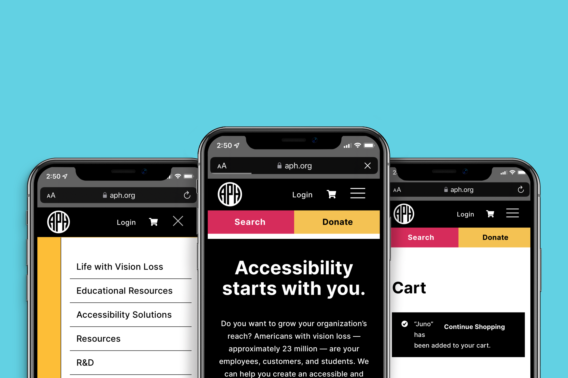
During my time with Mightily we were challenged to create a new brand aesthetic and website for APH, and we responded with a very ambitious campaign and design system. Our goal was to exceed ADA standards, making the experience as equitable as possible for the users with visual impairment and other accessibility needs. The complexity came from APH’s enormous amount of educational products and consumer products available for purchase or access through the APH website. The challenge for the team was to learn as much as we could about accessibility, incorporate those learnings into our user-centered process, and even tread new ground for web accessibility.
The PROCESS
While it looks like a fairly simple design, a lot of thought and research went into the choices we made. The following briefly outlines our process.
1) EMPATHIZE: The research phase included conducting interviews, surveys, and gathering secondary research to better understand who our users are, and what their needs are. This part of the process is probably the most important in the entire process because it allows us to put aside our own assumptions and biases to focus on what the user actually needs, not what we think they need. This phase of the process was absolutely crucial in that it included learning first-hand from some of the world’s leading experts in accessibility, classes for accessibility, user-focused surveys and interviews, and secondary research from leaders in accessibility like Google and competitive audits for large e-commerce competitors like Amazon and Barnes and Noble.
2) DEFINE: From the research, we began the process of focusing on user groups and personas, defining specific problems we needed to solve for these user groups. We discover patterns and trends across the research. This is where insights are born. And for a site as large and complex as APH, including educational resources, a massive e-commerce component, and resources for allies, there was a need for innovation and a lot of insights in to discover across the different user groups.
3) IDEATE / COLLABORATE: This part of the process is maybe the most fun for visual designers, as it allows us to take our problem statements from our user groups and personas and actually come up with creative solutions for them - a lot of stacks of Post-Its were consumed here. While we were ideating for interactive, we also started getting an idea for what this whole thing looks like. I'm going to be a bit more detailed here as it is the phase I was in charge of specifically.
As I began to understand who our users are and what problems they are trying to solve, and what the goals of the client are (in this case, brand awareness and empathy from the public, and to create the most accessible experience possible) I thought a lot about what kind of design system might best accomplish the task of creating something that is at once appealing to the typically-sighted public and allies of the visually-impaired, while focusing on something that is accessible for people with visual impairments.
Designing for accessibility on a 2D plane starts with contrast and legibility, then going into organizing information in intuitive ways to better facilitate useful interaction by those with accessibility needs, and benefit all other users as well. The design system had to address these things first.
THE INTERNATIONAL / SWISS STYLE
It turns out, these questions were considered in the 1950s by designers who were frustrated by the overly-decorated, hard to read designs of previous decades, opting instead to create a design style and typography that puts legibility and function as a priority. This called for high-contrast, minimal designs that utilized design elements to establish clear hierarchy and a golden path for the user’s eye. They wanted to create design that was accessible for the broadest group of users, particularly those who struggled with reading more ornate design. That was UX thinking at work, and it was a good starting place for my design exploration as it solved a lot of the problems I was also trying to solve. But it was just a starting point - there was more work to be done.
4) PROTOTYPE: The interactive team (Jason Lee Chris Miller) produced wireframes and prototypes and finally designs based on the approved branding direction. As part of this process, I was helping to work with the folks at APH to gather assets and content, as well as production assets for the site. With a site of this scope, building out functional prototypes - low res and high res - took a long time. During this time, we proceeded to hone in on design for other aspects of the brand.
5) TEST: This phase was and continues to be so important, as it allowed for us to interact directly with groups of different abilities in order to observe and catalogue the feedback. We then began the process of iteration and further testing. This cycle never really ends - you have to think of these projects as living, breathing, and ever-evolving products - there’s always new insights to be found in real users spending time with the product, and wise designers are open to hearing it and acting on it.
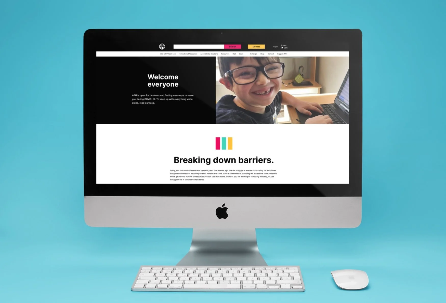
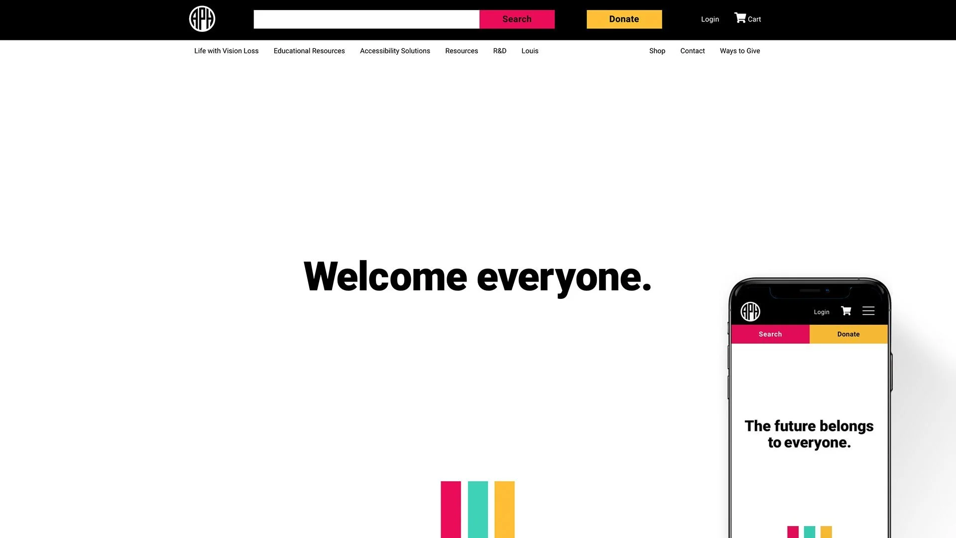
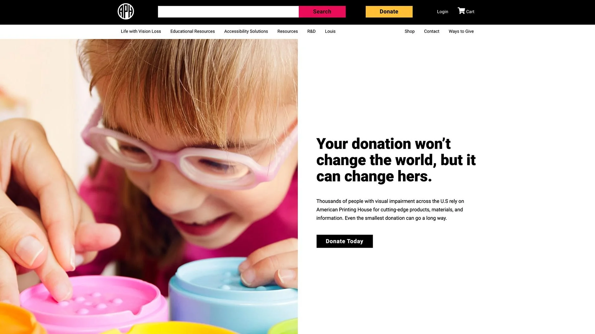
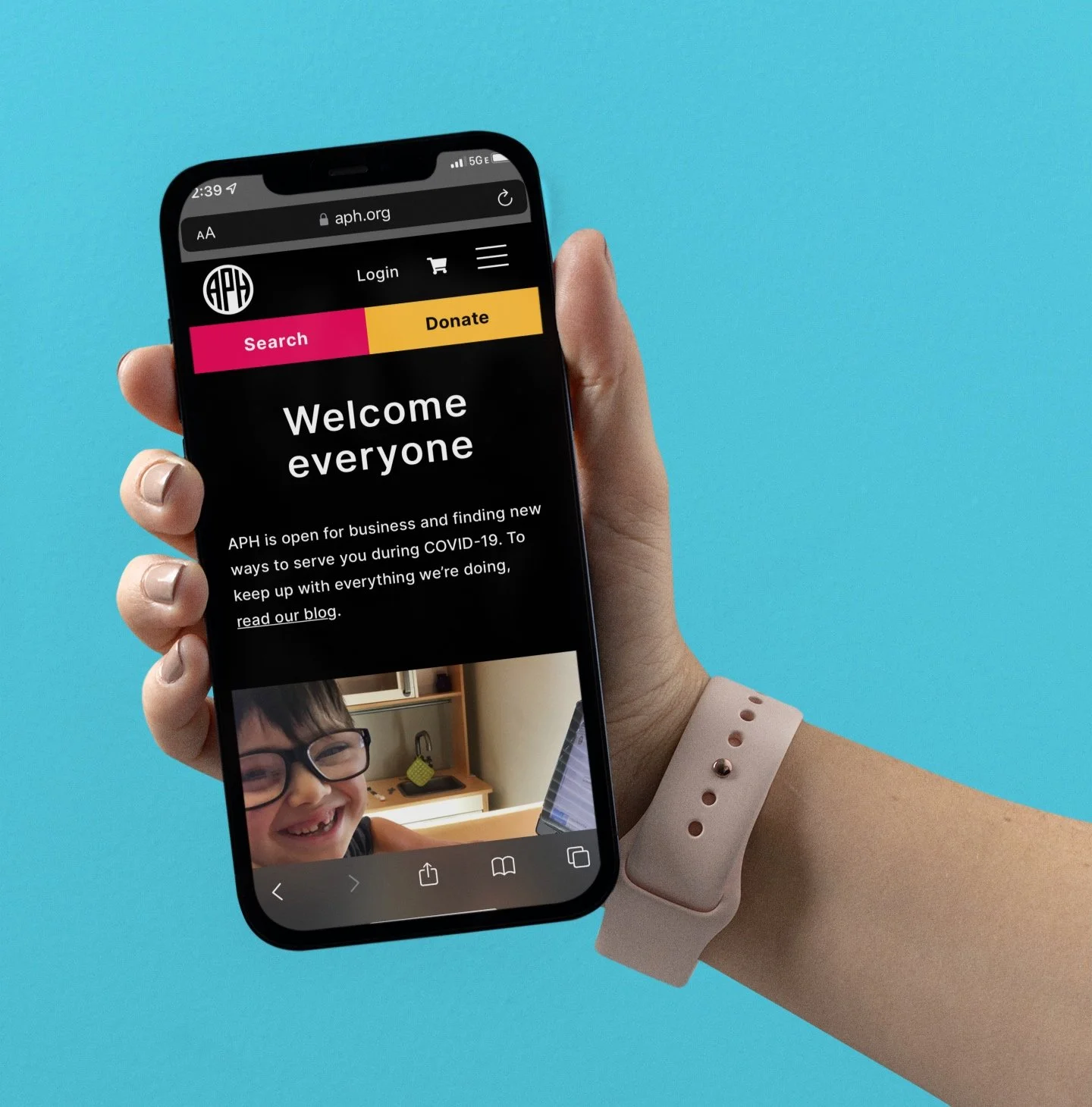
The Result
The new branding was implemented across 2D media, print, social, experiential, and interactive projects, and by most accounts it was successful in that it was a massive improvement over the previous offering in terms of user experience and aesthetics. The site allowed for a much more useable, useful, equitable, and enjoyable experience, putting them on equal footing with other national providers of educational products, and solidifying their position as the world-leader in offerings for the blind and visually impaired. As mentioned above, although it was successful, the launch wasn’t flawless - no launch is. As we gained feedback post-launch and always want to evolve the product further to be the best it can possibly be, we continued to evolve the product alongside the APH team. I don’t have specific metrics here as to the long-term impact that the new branding and website have had - I haven’t worked with Mightily for the last two years, and I’m not privy to the current state of the project - but what I can say is that I’m proud of the product we put forth, and proud of the way it was built with user needs at the center of every decision.